We've just been back from our time away, and our contractors used those weeks wisely. We are now happily using the kitchen and enjoying every minute of it! The following photos show the progress made during the final week of renovation. We started the renovation on July 7, and did lots of reconfiguring, but we didn't add any extra square footage to the kitchen/dining area. I'll be blogging next week with a full "before/after" comparison. I love that stuff, and it's so fun to do with my own kitchen!
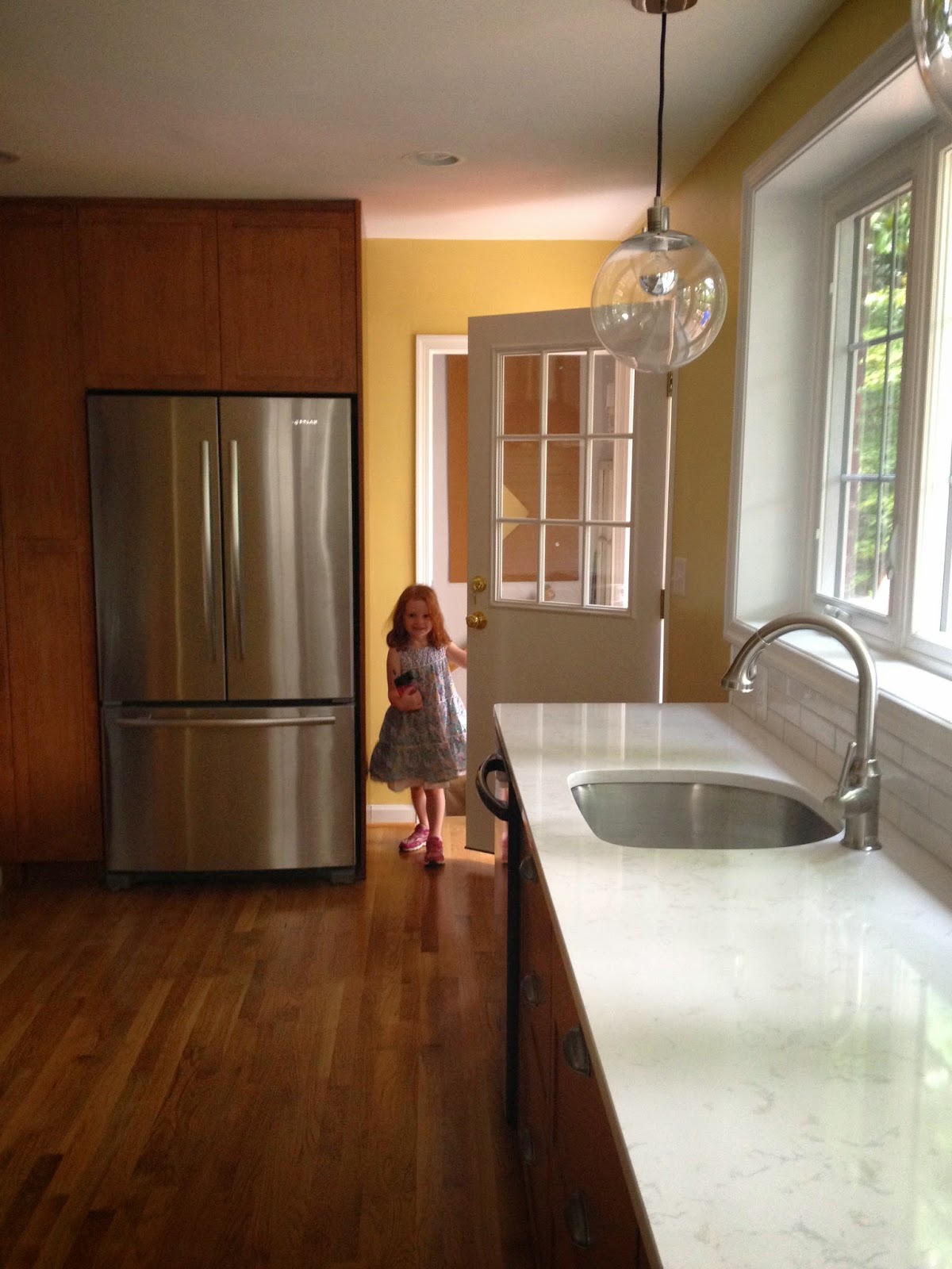
The first picture shows the new refrigerator with floor-to-ceiling pantry along the left side. You can also see the entrance to the steps that lead to the basement. (That remains in the same position as pre-renovation.)
Now you are looking at the opposite side of the kitchen from the basement entrance. This showcases the main change the space The window wall you see on the left faces out to our back deck and treed lot. It takes the place of an old sliding glass door. By removing the door, we were able to extend our lower cabinetry to the corner of the room. The window on the right was simply updated to match with the new back windows.
This is the range and upper cabinets, before the hood was added. This is the day the countertops went in. We love these! They are quartz countertops, made by Cambria USA. Our design is called Torquay.
Now you can see how the countertops work under the window wall. We also went with white subway tile, in an elongated shape. These are 2x8 inches. They have an irregular edge, which is accentuated by a very light grey grout. Remember all my concerns about choosing the right grout? I'm very happy with this choice.
Below you can see the range wall, with hood and backsplash installed. We ran the same color from the living room through the kitchen. It's Concord Ivory by Benjamin Moore, part of their Historical Colors palette. In this picture, you can also see a slice of our chalkboard wall. We used to have it on this wall that separated the kitchen from the dining room, and we all used it. So we decided to keep it and we love the punch of black!
Below is a nice vantage point across the gorgeous expanse of countertop. You can also see the fun pendants we specified for the project. They are the globe pendants from West Elm. We've gotten so many compliments on them. This shot also shows the new exterior door. This allows for access to our deck, and it makes sense to group the doors together. Plenty of clearance for in-and-out traffic.
I like the chimney stack style hood. We specifically didn't want the microwave hood, as we'd heard that they aren't that efficient. I briefly toyed with the idea of a microwave drawer to be embedded in the lower cabinetry, but that made me a little leery with the kids. Custom cutouts in the upper cabinets is the perfect solution. What to put in the cubby on the right? Cookbooks? Fun nesting mixing bowls?
Thanks for reading! I'll have a full "before/after" comparison next week.
Labels: design, Kitchen Renovation, organize